Context
The Review of Economic Studies is one of the top five economic journals but was lacking in visual appeal and mobile optimisation. The journal had a storied history but had never defined a brand, their old website used a default WordPress theme which was necessarily text-heavy, but especially difficult for readers to engage with the content.
Challenge
The challenge was to improve the design of the journal to make it more visually appealing, easier to understand, and more engaging for readers. Additionally, the content needed to be reorganised into shorter, more digestible sections with subheadings to improve readability and help readers quickly locate the information they are looking for. Before this, The Journal of Economic Studies wanted to define a brand that embodied its rich history of diversity and inclusion but with a cutting edge and future focused feel.
Brand strategy
and Branding
We began with a brand strategy workshop to gain a deep understanding of the Journal's history, audience, context in the industry, unique selling points, and future goals. Drawing inspiration from the journal's original cover from 1933 but bringing it into the context of modern academia, we created a fresh and simple logo that is modern yet timeless. Brand guidelines were created with a focus on typeface. As the site needed to be fairly text heavy, choosing fonts that were easy to read and that could help to define the different areas of focus on the site was a critical task.
Website design
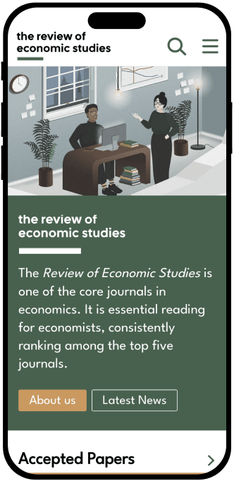
Our approach was to redesign the journal to engage readers more by incorporating more charts and graphs, using more white space and larger font sizes, and adding interactive elements such as hover-over text and clickable links. We also created beautiful custom illustrations to embody the newly defined brand strategy and add visual appeal to the journal. We worked with the client to reorganize the content into shorter sections with subheadings, making it quicker and easier for readers to navigate and locate the information they need. We also made sure that the journal was mobile-optimised, so readers could access and enjoy it from any device with ease.
Development
Our approach was to redesign the journal to engage readers more by incorporating more charts and graphs, using more white space and larger font sizes, and adding interactive elements such as hover-over text and clickable links. We also created beautiful custom illustrations to embody the newly defined brand strategy and add visual appeal to the journal. We worked with the client to reorganize the content into shorter sections with subheadings, making it quicker and easier for readers to navigate and locate the information they need. We also made sure that the journal was mobile-optimised, so readers could access and enjoy it from any device with ease.


Results
The redesigned Review of Economic Studies was a success. The incorporation of more illustrations, charts, and graphs, along with more white space and larger font sizes, made the journal more visually appealing and easier to understand. The addition of interactive elements such as hover-over text and clickable links made it more engaging for readers. The reorganisation of the content into shorter, more digestible sections with subheadings improved readability and made it easier for readers to quickly locate the information they need. The mobile optimization ensured that the journal could be accessed from any device, making it more convenient for readers.


Conclusion
Redesigning the Review of Economic Studies was an exciting project that challenged us to create a more visually appealing and engaging journal. Our approach to the project allowed us to incorporate more illustrations, charts, and graphs, add interactive elements, and reorganize the content to make it easier to understand and more engaging for readers. The final result was a successful redesign that improved the journal's visual appeal, readability, and accessibility, reflecting its status as one of the top economic journals in the world.


